AI Workflow
Design Systems
Agentic Build
Storybook
Context Engineering
I built an Agentic design system in 35 minutes - with 5 Context files.
18 components, 118 design tokens, a documented Storybook. The agent did the building. My job was to write my brand's rules down so completely it couldn't quietly break them — then to find the five places I hadn't.
Project type
Personal exploration
Stack
React · TypeScript · CSS Modules
AI tool
Claude — in VSCode
Build time
35 min
Outcome
Live system, 5 gaps found

What shipped: 18 components, 6 foundation pages, and 3 docs written for an agent to read rather than a person.
01 — Overview
What made me do this again?
A studio design system — tokens, primitives, compositions, docs, a Storybook — is normally a multi-week job. And the drift starts almost immediately: someone overrides a rule, the code still compiles, and a few components later the brand is quietly gone.
My last project proved an agent could build a component library from a single design.md. But that system was generic — the kind where any reasonable choice looks correct. So this time I raised the bar. Design + AI is a studio with a brand and most of its rules that sometime gets overridden without noticing.
#FFFFFF Page #1E1E1E Ink #E4F658 Accent #F6F6F6 Surface #808080 Muted
.
Six rules to govern what's non negotiables :
✕ No second color
✕ No bold, ever
✕ No CSS border
✕ No drop shadows
✕ No second typeface
✕ No emoji
Break one and the code still compiles, the page still looks fine on its own, and the branding is quietly gone. Nobody files a bug for that.
02 — Context
What I was actually worried about
Not that it would fail. Failure is easy — you see it, you throw it away, you move on. I was worried about something more expensive: the right hex codes on components that had stopped being the brand somewhere around the third iteration, in ways only I'd catch, one at a time.
Because the values are the easy half. A hex code copies cleanly. What doesn't copy is the reasoning underneath it. Why this system draws borders as inset shadows instead of using the actual border. Why the accent is only ever a background and never text. Why nothing is set in bold, even when a headline could clearly use the weight.
That reasoning lives in your head, not in your file. And it's the part that decides whether component nineteen — the one nobody documented — still looks like it belongs.

A ring, not a border. Painted rather than measured, so a hover state shifts nothing around it.

The two-tone heading. Muted setup line, ink payoff. Used everywhere, documented nowhere obvious.

Lime is a ground. At 1.4:1 against white it can't be text, so it never is.
So the bet was narrow: if the context file explains why a rule exists and not just what it is, the agent should be able to apply it to a case the file never mentions. If it can't, you get a system that's correct wherever it was told and wrong everywhere else — which is the expensive kind of wrong.
A rule without a reason only covers the cases it literally names.
03 — Approach
Writing the Context system
Before it was one file. This time I split it into five, mostly so the non-negotiables could sit somewhere on their own rather than buried on page four of a long document — somewhere the agent could check its own work against without re-reading everything. The whole shape is below, if it's useful to copy.
context/
├── 00-overview.md · 34 lines · THE NON-NEGOTIABLES
├── 01-tokens.md · 160 lines · color, type, radii, rings
├── 02-components.md · 461 lines · 18 components + props
├── 03-voice-and-content.md · 44 lines · voice, casing, vocabulary
└── 04-assets.md · 31 lines · logos, icons, patterns
730 lines total
The tokens came out of the Figma file verbatim. No rounding, no tidying, no renaming things I thought were named badly. That mattered later, in a way I hadn't planned for.
Claude asked four questions, because I explicitly mentions so
I pointed Claude at the .md files with a prompt, and it did was come back with four decisions it couldn't make on my behalf.
Question
Chose
Ruled out
What Stack + styling should the design system use?
React + TS + Vite, CSS vars + CSS Modules
Tailwind, inline styles
What does "agentic" mean here?
Agent-facing docs layer
AI-product components, a linter
How much to build in the first pass?
Everything in the context files
A vertical slice
How should the assets be handled?
The real brand files
SVG redraws, placeholders
04 — Design Process
The build ran clean. The Supervision was the work.
Tokens, then the eleven primitives, then the seven compositions, then documentation. It screenshotted each layer before starting the next one, which sounds fussy. It's the reason two problems never reached the components built on top of them.
Read + decide
Tokens
18 components
Fix
Docs + agent layer
Sections
Verify + fix
0:00
0:10
0:20
0:34

Every number on this page came out of one of these.
05 — Fidelity
the actual finding
What I found on supervision.
The constraints held. All eighteen components draw their borders as inset shadows and not one uses border — including several the bundle never discussed, and that was the specific thing I set out to test. The negative letter-spacing tracks size correctly everywhere. Nothing came back bold. No invented semantic colors, which is normally the first thing to go.
Rings, never borders
18 of 18. Zero border declarations anywhere in the system.
Tracking that scales
Size, line-height and letter-spacing ship as a locked trio, so you can't take one without the others.
One accent, held
118 tokens and no hardcoded hex values in any component's CSS.
Fluid without breakpoints
At 320px: no horizontal overflow, and no media query needed for type.
Then five things turned up. Most case studies stop before this part, which is a shame, because it's the only part that tells you how the next build will go. Every one of the five traces back to a sentence I didn't write.
01
I never said what colour the button's icon tile is
My components file describes a "60px spark tile" and then simply moves on. The asset index points at a background image for it that isn't in the repo, and the asterisk that goes inside ships as ink on solid white with no alpha channel, so it can't sit on a coloured tile without bringing a white square with it.
Fixed: lime tile, with mix-blend-mode: multiply knocking the white ground out of the real artwork rather than redrawing it.
I spent longer on this one tile than on several components. It's four words missing from a sentence.
02
Stat had no dark variant, and the panel it lives in is dark
Two other components in the bundle get an onDark treatment. Stat doesn't, because I never thought about it — but a proof-point stat is the obvious thing to drop into the footer of an ink quote panel, so that's where it ended up. Black numerals on a near-black surface. It compiled perfectly.
Before

After

Fixed: added onDark — white numeral, lime marker.
"Works on dark" is treated as a property of individual components in my bundle. It should be a property of the system.
03
My type scale reads like a heading outline, and isn't one
The bundle says "H4 — role listings" and "H5 — row titles". I meant those as sizes. Read as structure, they say to put an h4 inside a card that sits under an h2, which skips a level and breaks the outline a screen-reader user navigates by. Four stories failed on it and I'd never have caught it by looking.
Before — 4 violations
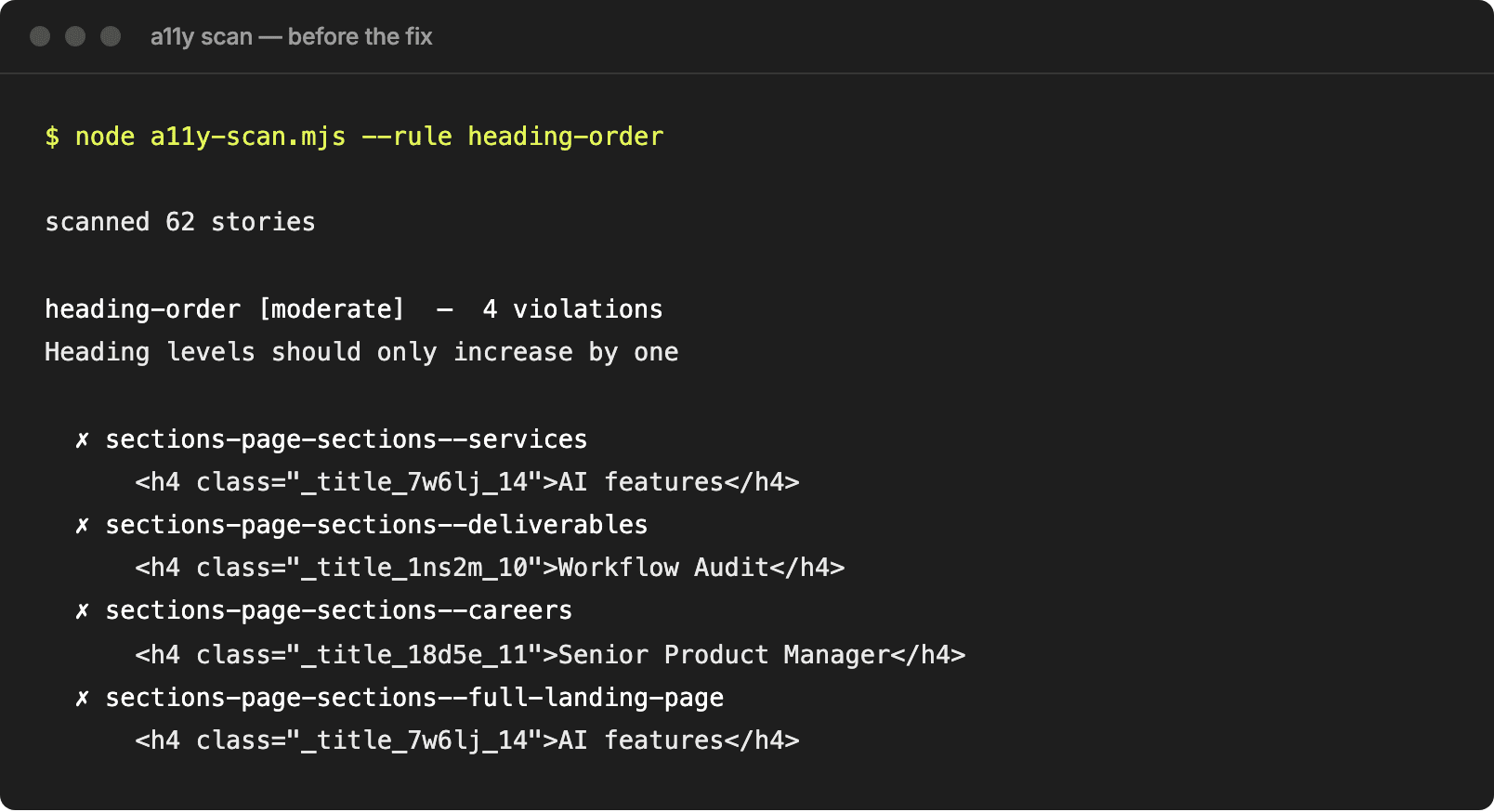
After — 62/62 pass

Fixed: cards default to h3 with a headingLevel prop for other nestings.
Two different systems sharing one set of labels. Worth separating.
04
A third of my asset index doesn't exist
Service icons, team photos, avatars, client logos, testimonial screenshots. All neatly catalogued with paths. None of them are files.
Fixed: a fixtures layer that generates on-brand stand-ins, with a table in the docs mapping every one back to the real path it's covering for.
An asset index should say which of these things I actually have.
05
Three of my grays fail contrast, and I left them alone
The accessibility scan turned up three gray tokens below WCAG AA for small text. The worst sits at 2.84:1 against a 4.5:1 requirement, which isn't marginal.

Not fixed, deliberately. Those values came out of the Figma file verbatim. Changing them here would put the code and the design source quietly out of sync, and the next transcription would put them back. So it's documented with exact ratios and proposed replacements, sitting in the Storybook waiting on a decision.
My bundle has no accessibility section at all. Of the five, this is the one I'd fix first.
None of these are things the agent got wrong. They're places I'd left room for it to guess, and it guessed wrong. That's the useful part: five defects in my specification, surfaced instead of discovered one at a time over the life of the system.
06 — Solution
What was built
Eleven primitives and seven compositions. Small on purpose: eighteen is about the amount of system a person can keep in their head, and that's the only reason a system stays consistent when nobody's watching.
Button
ApplyButton
Spark
Chip
Stat
StatusPill
AvatarStack
Eyebrow
SectionHeading
StepChip
ServiceCard
CaseStudyCard
ServiceRow
RoleRow
TeamCard
QuotePanel
CTABanner
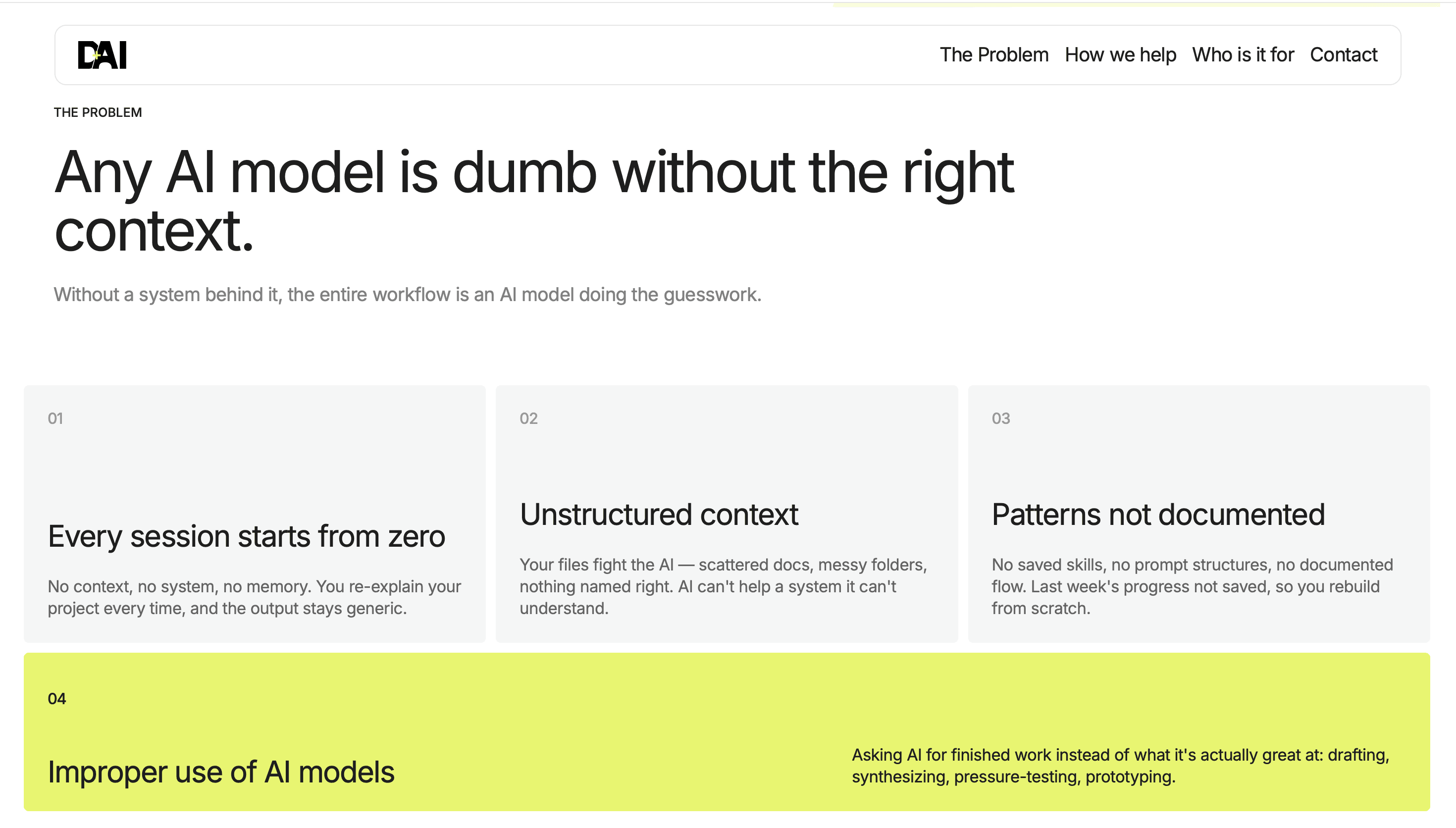
Composed into real screens
Assembled from those components and the layout tokens, with no one-off CSS anywhere.

Documented twice, on purpose
Storybook covers the human side. The other half is generated: a script reads the token CSS and the component types and writes them out as JSON, so the version an agent reads can't drift away from the version that ships.

Start Here → For Agents. Written for whatever picks this up next.

One source, two outputs. Regenerated on every token change.
07 — Outcomes
Where that leaves me
5
gaps found in my own spec — none of them were agent's
35
minutes, bundle to shipped system
18
components across two groups
118
tokens, no hardcoded values
62
stories, 28 documentation pages
That's worth more than a verdict on the tooling. I have five specific things to add to the context system and a fairly good idea of which one matters most — and the next build starts from a spec that's five holes shorter than this one was.
The constraints held
Six hard rules, honored across eighteen components, including ones the bundle never described.
Splitting the file worked
Isolating the non-negotiables meant the agent could check itself against them instead of me doing it.
The gaps are a to-do list
Five holes found, five to close before the next build starts.
Checking per layer paid for itself
Two of the five never made it into anything downstream.
08 — Learnings
01
Write the reason, not just the rule
"Rings, not borders" held in components the bundle never mentioned, because the file also explained that a ring is painted rather than measured. The rules I stated flatly only applied where I'd stated them.
02
Give the non-negotiables their own file
Not because five files beat one, but because a short list on its own is something an agent can check finished work against. Buried on page four of a long document, it's just more prose.
03
Every gap was mine
A colour I never named. A variant I never declared. A type scale I'd labelled like a heading outline. It's tempting to read those as limits of the tool. None of them are, and that's the good news — a tool you can't fix is a worse problem than a file you can.
04
The compiler will not save you
Four of the five passed typecheck without complaint. Stat rendered black text on a black panel and TypeScript had no opinion about it. Screenshots and an accessibility scan are what found them.
09 — Summary
What I'd tell someone starting this
01
Write the context before the prompts
And put the reasoning in. That's the part that travels to the cases you didn't anticipate — which is most of them.
02
Let it ask, then let it run
Four questions up front beat a dozen mid-build corrections, provided the questions are ones that actually change the output.
03
Check each layer, not the end result
Two problems died in the primitives instead of propagating into everything built on top of them.
04
Treat what breaks as spec debt
The gaps this build surfaced are the next version of the bundle. That's the actual deliverable.